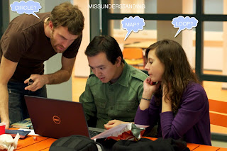
 On the course lecture on March 15, concept 1 and 2 were showed to the class group and professor. During this presentation several remarks were pointed.
In general, the concepts stepped out from the assignment boundaries; not using a geometric circle and incorporating a line to mark the route were the main objections. The map concepts were too literal for the assignment’s purpose.
The use of color and popping out (by using drop shadow) brings a highlight effect to those places that required standing out. These are ideas to keep in mind for the posterior elaboration of concepts.
The team requires further development of the map. The presentation served to a better understanding of the assignment itself.
Yes, the color and shadows have effects on the icons. But I don't know which aspects of the color do you take? The huge, saturation or gradient?
ReplyDeleteFurther, could you show the circles of the map?
Group X
@whatchagotthere you can see the old concepts on the tag "Visit Delft! - Concepts"
ReplyDelete