Wednesday, March 30, 2011

CONCEPT TEST 1 - ROTTERDAM (March 27)

Because three concepts were made, it was necessary to narrow it down into one to do a first user test. The goal of this quick first test was to narrow the concepts into 1 idea in order to generate a final concept with the resultant key elements.

In order to select which concept is to be chosen and tested a visit to the tourist info office in central Rotterdam took place. This visit was mainly done because at tourist info points they are use to deal with visitors and have an idea about how to indicate direction to them.

From it, it is important to highlight that the three concepts have elements to incorporate on the final version of the map.

According to the person interviewed, concept 1 has a better overview but is lacking information, which can be confusing. The color contrast works to indicate direction.

Concept 2 is clearer about pointing museums and shops. This is achieved with the icons. Concept 3 is useful because of the text. Street names help the visitors to locate themselves on their own map.

Because concept 2 is the clearer based on shopping and cultural visits, it was used for a quick street test.

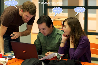
For the test 6 randomly picked people on Rotterdam center were questioned. Two questions were asked; firstly, if they could note any differences between both of the concept versions. Secondly, which direction would they walk when looking at the concept as a map?

In general, people didn’t understand the relationship between the concept and a map. The difference that was mainly noted was the gray color changing from one version into the other one. The user

s did not see a clear distinction between shopping and cultural visit icons. They didn’t relate the images with the activities and they wouldn’t walk on the desired direction.

In conclusion, the team has to develop the map further. The icons must be clearer. It is necessary to use more “direction guide” tools in order to point the route better.

The team considers that it may be a good idea to unify the three concepts. This means, use a nice overview with color contrast and pop out for direction, include shopping and cultural-sites icons and add the street names for better comprehension of the map.

NEW CONCEPTS


On Friday March 22 the team got together in order to discuss different concepts that had been elaborated after the presentation. Three concepts were discussed.

Concept 1

Basically, the concept uses fading in and out of lines in order to indicate direction. In addition, high color contrast (yellow-black) is used to guide the visitor into the right direction.

Concept 2

The concept shows museums and shops with an icon. It also adds different shades of gray in order to indicate walking direction. In addition, it uses pop out to highlight the icons.

Concept 3

This concept is based on street names; it seeks to provide more information to the visitors. The size variation of the first letter of each street as well as the text direction gives the idea of which way to walk.


INSPIRATION

After the presentation we sat down to talk about new concept development and looked for some images to inspire our selves!

CONCEPTS PRESENTATION

On the course lecture on March 15, concept 1 and 2 were showed to the class group and professor. During this presentation several remarks were pointed.

In general, the concepts stepped out from the assignment boundaries; not using a geometric circle and incorporating a line to mark the route were the main objections. The map concepts were too literal for the assignment’s purpose.

The use of color and popping out (by using drop shadow) brings a highlight effect to those places that required standing out. These are ideas to keep in mind for the posterior elaboration of concepts.

The team requires further development of the map. The presentation served to a better understanding of the assignment itself.

Sunday, March 27, 2011

Overload of visual clues?

The Chinese website SooDoo is a good example for cultural difference in displaying visual information. For our western perception the website is very cluttered and contains too much visual clues (especially the multiple use of motion and colours).

Although in the Asian world this manner of displaying information is considered as clear and easy to read. As stated in the paper by Cha, Oshlyansky and Cairns, Mobile Phone Preferences and Values: The U.K. vs. Korea (In-proceeding, IWIPS 2005, Amsterdam, Pages 29-42), UK users prefer a layered structure of information where only a limited amount is shown at the same time whereas Korean users prefer a to see all the information at the same time. Both groups consider their preferred structure as easy and giving them the best overview over the provided information.

This shows us that the perception of visual clues is inherently different among different cultures. Visual design, therefor, should always be performed in awareness of the intended target group.

Tuesday, March 15, 2011

Hit the City!!!

...so for Assignment 2, team has to get to know the city a little bit again... The idea is to experience the route in one of the two ways proposed for the exercise and see what the city has to offer. Could this be of any help?

Sunday, March 13, 2011

Camouflage

It is interesting how objects in our environment have a tendency to disappear from our vision.

Why does this occur? One reason, our brain relies on contrasting colors to perceive differences. In this case, birds are the same color as the tree, making it extremely difficult for our brains to decipher them from their surroundings.

Tuesday, March 1, 2011

Image Analysis Usign Visual Thinking

By clicking on this link you may visualize the document of analysis of four different images, by using different tools of VISUAL THINKING FOR DESIGN